Minimalist Design: A Brief History
To some web designers, minimalism is all about aesthetics. They’re mistaken. To avoid falling into this conceptual trap, let’s have a look at how minimalist design came about.
Even though minimalist design is relatively new in the world of web design, it’s foundational concepts are pretty old. When examining its roots, traditional Japanese culture might be a good place to start. Simplicity and balance are among the top values in Japanese culture. Minimalist aspects have long been used in Japanese graphic design, art, interior design, and architecture.
The minimalist movement in the West started at the beginning of the 20th century. Many architects started using minimalist designs after being influenced by the advent of steel, glass and other modern materials. One of the movement’s forerunners was German-American architect Ludwig Mies Van der Rohe. He’s believed to be the first to employ the “less is more” approach to architecture.
The minimalist philosophy quickly permeated other industries and arts such as music, painting, industrial and interior design. In the 1960s, minimalism became a popular direction of visual design as many artists gravitated toward geometric abstraction in sculpture and painting. Donald Judd was among the established minimalist artists who inspired the movement as his work was replete with simple color combinations and shapes.
A vital principle of minimalism in a wide variety of visual arts was to leave only a feature’s most fundamental part to serve as the primary focus of attention and to exude elegance.
Minimalism in Web Design
Contemporary minimalism is a powerful modern web design technique. Its rise to popularity was the response to a trend in which web design become increasingly convoluted. Research has shown that visual complexity influences the perception of users. Web designs laden with numerous appear complex to a user.
When we correctly apply minimalism to web design, it focuses users’ attention and simplifies tasks. Cleans designs can reduce bounce rates. Other benefits of minimalist web designs include compatibility on multiple screen types and faster load speeds.
Google Search is one of the best examples of employing a minimalist approach to web design. Since it’s 1990s beta offering, Google continues to prioritize simplicity as a key aspect of all its interfaces. The search function is central to the design of the entire homepage. Besides branding, Google steered clear of all unnecessary page functions.
One might deem minimalism uncomplicated because of its apparent simplicity. However, there’s a lot more than “less is more” under the surface. Let’s examine the characteristics of minimalist web design.
1. Just the bare essentials
A minimalist web design strategy simplifies interfaces by eliminating non-essential and non-functional elements and content. The approach rigorously prioritizes elements, leaving only the most important and stripping away distractions such as needless decorative elements. Every design item—be it copy or an image—should have a clear purpose; otherwise, it is eliminated.
Just make sure that removing an element doesn’t make vital user tasks more difficult. The point is to focus and clarify your message, not hide it. Design around the content and use just enough visual elements to support easy navigation and prevent confusion.
2. Negative space
Among the most important and powerful characteristics of minimalism is negative space; that is, the space surrounding visible elements. The emphasis on an existing element is directly proportional to the negative space around it. This concept is referred to as the ma principle in Japanese culture.
3. Visual characteristics
Every visual detail plays a significant role in minimalist web design.
- Flat graphic elements, textures and icons
- Limited color scheme
- Vivid illustration and photography
- Contrast
- Dramatic typography
Employing Minimalism in Your Web Design
Minimalist web design requires the same—if not a higher—level of functionality and clarity as a non-minimalist design. For that reason, many web designers find it quite a challenge. Keeping the following best practices in mind can improve the likelihood of a successful design.
1. Give each screen a single focal point
Designing around content is central to minimalist philosophy. All the visual elements serve the content. The goal is to improve the clarity of the message by eliminating distraction and steering a user’s focus to what’s most important: the content. Having a strong focal element makes it easier to identify superfluous elements.
2. Use the top screen area to set high expectations
Every page element that the user can see without having to navigate further should entice them to explore the rest of the page or site. For that to happen, you need to deliver exciting content to hook the user. Place high-priority content on top of the screen and surround it with plenty of negative space. The density of the content can increase as a user scroll down.
3. Use concise copy
Omit unnecessary words from copy, leaving only the bare minimum content needed to deliver your message.
4. Simplify navigation, but don’t hide it
Simplicity is not necessarily synonymous to minimalism. Still, simplicity is one of the main aspects of minimalist design. A user interface that lets users carry out tasks easily with no distractions provides a simple user experience. A key factor of simplicity in web design is intuitive navigation. Many designers make the mistake of hiding navigation and end up lowering discoverability.
5. Use functional animation
As with all the other elements in minimalist web design, include only useful and subtle animations. Good UI animations are purposeful. For example, you can use animations to save screen space by revealing hidden details when a user hovers on an element.
6. Employ minimalism in portfolios and landing pages
Even though every website can benefit from the minimalist ideas at the core of content-centered designs, there are cases where a minimalist aesthetic doesn’t work. Minimalism is especially suitable for landing pages and portfolio sites that have relatively little text content and simple goals.
Employing minimalism on a complex website can be a challenge. Content-rich sites can suffer from a lack of elements, especially when the user has to frequently scroll to view more content. For these sites, the optimal strategy might be having a minimalist landing page that steers users to more content-rich pages.
Looking for a minimal website template?
We got you covered! Here are our five most popular minimal HTML5 templates:
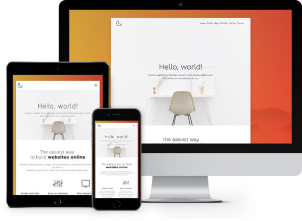
 Moon: Free Minimal Multipurpose Bootstrap Template
  Gaming: Bootstrap Template for Gaming and Hosting
  Itsy: Free Full-Featured Cutesy Little HTML5 Template
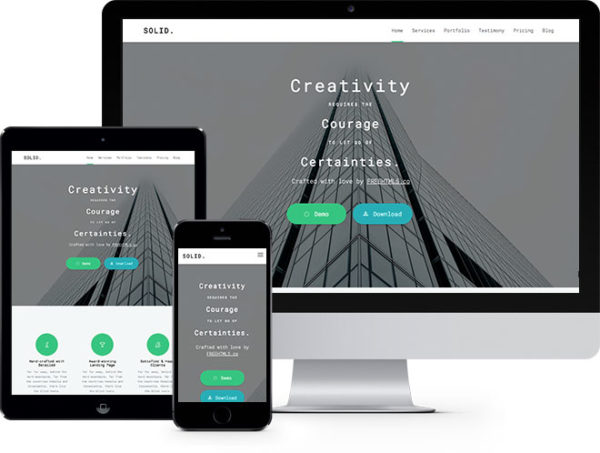
  Solid: One Page Free HTML5 Bootstrap Template Multi Purpose
  Light: Free HTML5 Template Bootstrap
' excerpt_length=20 excerpt_by_words=1 post_html='
{text_title}
{summary}
']
This is only the tip of the iceberg! We have a lot more… (browse them all)
Bottom Line
Minimalist web design declutters interfaces by eliminating superfluous elements and content that non-essential and non-functional elements. As a result, the usability and aesthetic of the websites improves dramatically. A gorgeous, easy-to-navigate website is a powerful communication tool.

